
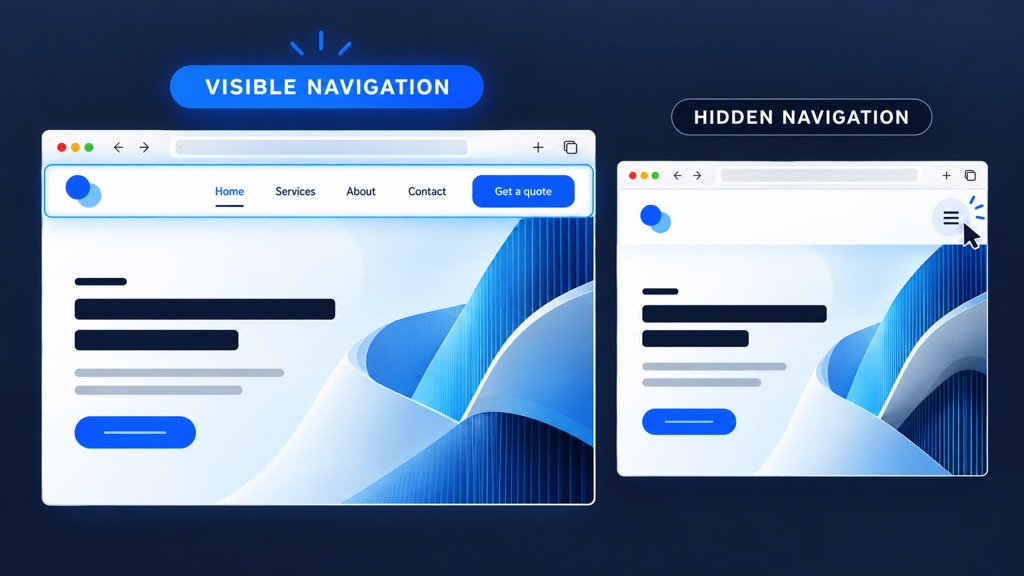
Why Visible Website Navigation Makes a Difference
Your website’s navigation helps visitors understand what you offer and where to go next. Although hamburger menus can look tidy, hiding your main links adds an extra step. Keeping navigation visible, particularly on desktop screens, makes browsing simpler and gives important pages prominence.
Visitors can see their options straight away
A visible menu introduces your website at a glance. Links such as Services, About Us, and Contact tell people what to expect. A hamburger icon requires visitors to open the menu before they can find those options, making exploration less immediate.
Fewer clicks make browsing easier
Every additional interaction asks visitors to make an effort. With visible navigation, they can move directly to the information they need. This is especially useful for someone comparing services, checking your experience or looking for a way to get in touch.
Important pages receive more attention
Pages hidden inside a collapsed menu are easier to overlook. Displaying your main sections keeps them in view and gives visitors more opportunities to notice relevant services or useful information. Clear, descriptive labels help people choose their next step with confidence.
A clearer route towards enquiries
When your contact page or quotation button is easy to spot, interested visitors have a clear next step. Visible navigation supports that journey by keeping essential destinations accessible while people browse your website.
Choose the right approach for each screen
Hamburger menus still have a place, especially on mobile devices where space is limited. However, desktop layouts usually provide enough room to display your key links clearly.
The strongest approach is often to show your main navigation on larger screens and adapt it thoughtfully for smaller ones. Keep the menu concise, use familiar wording and make your primary action prominent. Good navigation helps visitors move forward without unnecessary guesswork.


